Friday, 4 May 2012

Technologies

We have used a numerous amount of technologies through out the making of our promotion package, firstly we used the Internet to look into conventional horror and psychological thrillers, we specifically looked into how the trailer was constructed and the state of equilibrium.
We used a digital camera for the animatic which allowed us to see what the shots would look life before recording and experiment on what type of shot would look best e.g long shot, point of view shot, we also used the camera to take pictures for our posters and front covers.


We then used a camcorder and tri-pod to record the footage of the story, the tri-pod allowed us to keep the camera steady and to reach angles that we wouldnt of done ourselves
When recorded our footage we put it on Adobe Preimere elements which allowed the group to edit the shots to what length we wanted them to be at and to use special effects and transitions to make the trailer more realistic.

Another Adobe programme that we used was Adobe in Design, which allowed us to edit the pictures that we toke to transform them into posters and magazines.

We also used Blogger which allowed us to update our project as we went along

Theories

We have followed theories such as Todorov's theory which is
  1. A state of equilibrium at the outset of the narrative
  2. A disruption of the equilibrium by some action
  3. A recognition that there has been a disruption
  4. An attempt to repair the disruption
  5. A reinstatement of equilibrium
We have followed this from the start of the storyline where the boy drowns in the lake and the sister is upset that she cannot help, but when they are in school this is disturbed again as her 'friends' wan to go back down to the lake and she still is mourning over her brothers death, this is then shown when a hooded figure down at the lake is identified and wants to get revenge. However we did not follow the last point as we want to leave the audience with a code of enigma, not knowing who the killer is.

Another theory that we followed was Charles Perry of industrialisation brought with its venerable members of society effected by the changes around them. W have used this in our trailer through the character of the sister of the boy who drowned not being able to move on and not excepting the fact its ok to go back down the lake.

We have also used Levi Strauss's theory of the definition of opposition structure. For example the sister loved her brother so now she is experiencing hate towards her friends for not helping him and also that she has been experiencing suffocation whilst her friends have been enjoying the freedom and not worrying about the boys death.

Themes

The key themes of our trailer is
  • Death
  • Isolation
  • Revenge
  • Weakness
  • Past, Present, Future
From our film title it is sensed 'Asphyxiate' is ways of which victims are killed, which the meaning refers to drowning, suffering and strangling. This is identified from the beginning of the long shot of the drowning of the boy and is viewed as weakness as he cant swim to saftey.     
We have also based the story on the girl wanting revenge on the friends for not helping her brother, which is still a pyschological element that she stil wants to get revenge 5 years later, so she believes in order to make herself move on she must do this. Although we didnt want the audience knowing to much we wanted them to be left with a dofe of engima on who survives and who is the one getting revenge.
 I believe another big key issue is isolation in our trailer because it is conventional in horror trailers such as the trailers we have focused on 'Sorority row' this gives the audience a sense that the characters are in an uncomftable postion because they are vunerable to others when they are alone. We can see this from a close up in the trailer of Ryan being strangled shouting 'HELP' and nobody comes to help because he has been on his own, and also another phrase 'is anybody out there'

Characters

Will- was the boy who drowned in the lake and was identified as a helpless victim and had been seen as a possible protagonist through out the film trailer haunting the lake.

Elyse (Sarah)- Is one of the main characters ans is known as the Villain however she can be seen as helpless as the pyscological side of her brothers death left her wanting seek revenge of her 'friends' emotionally, physically and intellectually for them being so heartless. We have focused on Sarah the main character so the audience can emphasise with her and maybe sympathise with her. We used this through the black and white effect as a 'flash black'.

Paige, (mum)- Another character that had a main leads the mum of the boy who drowned in the lake, we wanted the audience to also sympathise with the mother as well because she has lost her son, as the trailer goes in we see that she wont let her daughter go down to the lake on her own but it gives a code of enigma, why would she go down here? but is shows a close relationship between the family.

The Victims (Millie, Hannah, Ryan, Nia, Jess and others) - The victims try to be sympathetic and kind towards Sarah and ask her to join the party, we wanted the audience to have a love hate relationship between all of the characters as they all have split personalities. There are difference in the stregth of the characters some can be seen as weak 'go have a look' this emphasises they dont want to do it theirselves.

Target Audience

We identified the target audience by using the actors who were roughly between the  age 15-20 who were both genders. However because we have used a complexed film title for our trailer we have widened the range of our audience to 15-24. I believe that this age range also like camping and working problems out intellectually.
   I believe our trailer appeals to the target audience by using characters roughly the same age as the actors so they can relate and emphasise with them. I also believe because there are mostly girls in the trailer they can relate more to the characters that they usually would in a stereotypical horror film.
  The target audience will recognise the genre of the film due to the soundtrack, non diegetic sounds such as 'boom' lighting, establishing shots such as the protagonist overviewing the party and vunerable shots of the victims.

The audience thought the setting  was appropriate as the location was a forest lake conventionally represents isolation, fear and darkness, as well as the water can represent calmness and it being an effect of characters death


Evaluation of the film trailer

The film trailer we have produced is successful in ways that we have followed conventions of the genre, horror. We have also followed theorists such as 'Todorov's' which is when a state of equilibrium was always at the start of the trailer, and then problems are stated disturbed. We have also left a code of enigma of a 'red herring' effect which is one of the effects that we found when we were researching into horror trailers. We did this because we wanted to leave  the audience unknown of who the killer was and what was going to happen next which is what we wanted so they would go and see the film.
   I believe that we have used specific codes and conventions through our trailer such as dark lighting, long shots of isolation, panning of the mise en scene to show vunerbility and isolation.
 

How the trailer would be consumed


The target audience would find the trailer using a veriety of digital technology for example, TV, radio, internet and cinema making the audience known as 'Technofiles', I believe this is the case because the target audience is the range of 15-24 they can control what they do and what they want to see they could do this through the internet, you tube and see the trailer under the genre of trailer that they have been watching previously.


A way of the trailer being consumed would be through watching other films at the cinema or on DVD where you would pay to watch the film but get free advertisment.


Thursday, 3 May 2012

About the focus group

1/5/2012 We asked eight students, four boys and four girls between 15-24 which was our target audience for our trailer to come and watch our trailer so we could get feedback from the audience. However due to people not being able to make the focus group we had two boys and four girls between the age group of 15-18 to watch the trailer. Through out the focus group we asked the six students to fill out the questionnaire that consisted questions about the film. We then asked open questions about the film posters and magazine front covers that we made as well as having a general discussion about all three texts. 
   The results from the questionnaire and the discussion were generally positive. As 100% of the group said that the trailer was the genre horror, 90% of the group said that the target audience is for both genders which is also what we wanted to hear. Everyone out of the group stated the basic plot of the story and 80% of the group didn't know who the protagonist was. I believe that because the majority didn't know who the protagonist was they would go see the film because they stated that 'they want to know what happens' 'it was a great storyline' and 'it left me shaken' i believe that we had a positive feedback and it was an advantage to us as a team to see that our  package of the three text's had worked. 

Thursday, 26 April 2012

Audience Feedback Questionnaire

1. What genre do you believe the trailer is?

  • Comedy
  • Horror
  • Psychological Thriller
  • Action
  • Sci- Fi


2. Which gender does the trailer target at?

  • Female
  • Male
  • Both


3. What age group do you believe the target audience is for the trailer?

  • 13-19
  • 16-23
  • 15-24
  • 18-53


4. What 3 images stood out the most for you?


5. Can you reveal the basic plot of the story?


6. Who do you believe the protagonist is? (Killer/main character)


7. What are your emotions after watching the trailer?


8. Do you think the trailer reveals too much?


9. Would you go see the film in the cinema?


10. Do you think the soundtrack goes well with the shots in the trailer?

My film magzine front cover

Here is a first draft of my film magazine, i have used other film magazines such as Total Film and Empire to use as guide lines on producing my magazine so it would follow the conventions.


  • For my poster i have used a close up image of the protagonist making eye contact with the audience to make there attention draw to the magazine. I have used iconography of the reference to the water to relate back to the film and the character rising from the water to also relate back to my film poster 'Karma lies in the depths beneath' which emphasises the fact that the protagonist wants to get revenge on her 'friends' and names
  • To make my front cover look conventional i have used subsidiary images  that relate to the genre of the film magazine and also eye catching titles such as 'full access to' 'the uk's top selling magazine'. I have also used the masthead of my title to relate to film 'Caption' so the audience can relate the meaning of getting images and looking at the footage
  • I have used red, white and grey as a colour scheme as i believe it works well together and is appealing


  • For my front cover i have used the same conventions as 'total film' by a close up of the main characters focusing on the eye contact to attract the readers. I have also used banners, titles and a bold masthead.
  • from the total film magazine and my front cover it is evidental that the film the magazine is focusing on is in bold white writing that can stand out the most so the reader can relate to the film the most

My final draft of film poster and explanation


  • My poster focuses on the mise en scene and iconography most i believe this is a key issue to show where the location of the film and also because water is one of the main focus in the trailer
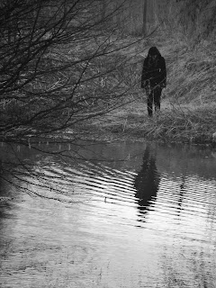
  • I have used the image of a blacked out figure standing by the lake to show hidden identity with a reflection of a shadow which references to a 'ghostly effect' floating on the water rising to the surface, I have also got a ripple effect in the water to suggest movement from below.
  • I have used a bold black and red title which the colours emphasise darkness and death and highlighted the word HATE because it relates to one the trailers themes.
  •  I have used conventions from other film posters such as a tag line, billing block and date. I have put the tag line just above the surface because it relates to the water and can relate to something coming above the surface.
  • I believe that my film poster follows the same conventions as 'friday the 13th' as there is figure of a person over viewing the lake. The mise en scene is roughly the same containing trees, and water.
  • The main images are both long shots with dark lighting to emphasising fear and isolation
  • From looking at 'friday the 13th' poster i have followed the same conventions such as the billing block and website

Monday, 16 April 2012

Image for my film magazine

I decided to use an image of a character for my film magazine because i believe that the readers would want to find out more about the movie than the actor

1st draft of my film poster

I decided to ask the class to look at my poster so i could improve on details that i needed to, to make it more appealing to the audience.

The image i chose for my film poster

I chose the last image because i found the ripples and the reflection in the water really effective  however i decided to edited it to make it more visible and clear by using 'paint shop pro'

ideas of pictures for my film poster

Filming

Our group had a meeting for filming dates. There were a few problems as some of us didn't have the same frees so we had to look at our timetables and agree to certain dates and times, even if certain members of the group were absent we discussed what shots could be filmed with out needing as many people we did this because we needed to take advantage of the cameras use because there are only 2 cameras with 3 groups.

Times that we agreed on:
Wednesday 8th February - Filming in school
Thursday 9th February - Filming in school 
Tuesday 21st February - Filming in school/ filming at a house
Tuesday 28th February - Filming at location of lake
Wednesday 29th February - Filming at location of lake
Thursday  3rd March - Filming at location of lake
Sunday 11th March- Filming at location of a river
Wednesday 14th March- Filming at location of lake- Number of actors needed and props including tent, sign
Monday 19th March- Filming at location of lake


We followed these dates and where we were going to film well, however there were times when we had to cancel filming due to weather and because it was being to dark so we had to re-organsie dates. 

Animatic of film trailer


Group Discussion for film trailer

Tuesday, 10 January 2012

5 Pictures of Effective Film Posters.

I find this poster effective because you can see the character is in a uncomfortable position where she looks like she has seen something that has frightened her, it only has one image which is more realistic. The poster consists of titles, names of actors and the date the film realised which is basic.


 I find this horror movie poster effective because the poster emphasises what happens in the film, the long shot of the girl sat on the chair with her hair over her face suggests that she is isolated. The dark shadow around the outside of the poster is very murky which could be a representation of the girl. 


                                                         I relate the film posters titles to our storyboard of our film, 'Eddie is returning' and i think the title 'the past never dies. It kills' also relates into our film because Eddie is coming back from the dead, his poster emphasises that someone is back from the dead.


This poster is an example of another idea of our film, instead of the villain being burnt alive, he was drowned. It only has one image but still looks effective because of the colours on the poster as well as the weapon.


This poster shows the venerability of the girl, her emotions show how nervous and scared she is. The lighting of the poster is dark to suggest the atmosphere but also shows shadowing of light, which could emphasise safety. The poster consists titles and the makers of the film and the films they have previously made in the past which the target audience may be interested in. 


Monday, 2 January 2012

A critical analysis of the animatic process of our groups film trailer questions 11 & 12

This image suggests that a venerable girl in her teenage years is being dragged and suggests that she is in an uncomfortable position the target audience can emphasise with her if they have learnt about her character earlier in the story.


This close up picture of the boy being forced into the lake shows suspense when you don't know if the boy will survive, was it on purpose? it creates a mind puzzle for the audience because you don't really know whats happening or whats going to happen.


The long shot of a figure running through the woods is another mind puzzle, it makes you think, who is that? why are they running away? have they been seen? the audience might begin to be on edge because they don't know what is going to happen to the friends 


An image of two girls on their way to the lake laughing and joking listening to music and singing suggests that they are happy, but how long for? does the audience know they are going back to the lake? will this make them even more tense.
A medium close up of the outside of the tent with one of the girls inside it. This is a point of view shot of Eddie looking in the tent. This shows that the girl inside the tent is feeling scared and looks venerable because shes huddled up.

12. I have been one of the actress's in the animatic and believe i have a successful role in our group i have attended all meeting, photo shoots, put my ideas towards this new storyline and have been learning about the editing when we were completing the animatic. I think I should put even more effort aswell as the others in on the actual making of the moving trailer if we want it to be more successful than the animatic

A Critical analysis of the animatic process of our groups trailer

1. An animatic typically consists of pictures of the storyboard synchronised with the storyboard. The function of the animatic is it allows the animators and directors to work out any screenplay and camera positions.

2. An animatics process is to give you an idea of how the scene will look and feel with motion and timing. In the animatic there will be rough dialogue, a sound track will be added to a sequence of still images to test whether the sound and images work effectively together.

3. Separately all of the class came up with there own plot synopsis. We then got put into group which we will work in for the coursework. I was put into a group with Elyse Holder, Millie Edwards and Sophie Cashell we had a discussion on what story we would use as our final plot, we each discussed the positives and negatives of our ideas and came up with a totally different storyboard from all of our ideas. From this we all added in ideas of which we would believe would work for the storyboard and the animatic. The group decided to base our story on one of the 'Friday the 13th'.

4.
  • Before organising schedules to take photos for the animatic we had to make a storyboard, so the group would know what kind of pictures to take when we got to the location of which the pictures would take place at. On the storyboard we would analyse each picture so we knew what angle of shot the picture would be, where it would be, and if there would be any diegetic or non diegetic sounds to go with the picture.
  • Overall The group toke around 50-60 shots, this was because we would take about two pictures for each shots so we could decide which picture had better quality and would fit in the best. However we only used approximately half of the shots because we took away some shots that didn't need to be used and by that we added several shots because of titles that need to be placed between shots.
  • Altogether we used 2 locations, a forest near school site, a road and the lake and forest which was in pandy. When we were at locations we used several props such as a tent, a car, a white hoodie type coat for the actor of Eddie and torches.
  • The group decided to use ourselves- Elyse, Myself, Millie and some close friends to act Annika and Scott, this gave the group an advantage because they were accessible school friends and we knew we could rely on them.
  •  When We were at the locations ready to take photo's we realised that we could experiment with each shot and take them a bit differently, for example low angle, high angle and point of view shots to make the animatic more realistic and make the viewers look like they can emphasise with the characters in the animatic.
  • There was only a few shot that we couldn't do and that was making Eddie look like he was struggling in the lake. So we had to decide to through stones in the lake and to take a picture of the splash to emphasise that the splash was Eddie struggling in the water.
  • As we were taking pictures for the animatic the story seemed to progress even more, I realised that we should do a black and white background story of Eddie being pushed in the lake which meant that the audience could relate and understand the story more. Also when we were in the editing suite Myself and Elyse downloaded a background music piece that allowed the pictures and the titles to fit in with the style of music.
5. Whilst in the editing process of constructing the groups animatic Myself Elyse And Millie put the pictures in order of our storyboard, this gave us an idea of how the film would look with pictures we toke ourselves rather than just drawing. We realised that some pictures would look better in a different order than they were originally planned to be at. Once we added the pictures, we added titles and transitions and placed them in the correct place that we thought that appealed to be the best. This would allowed the audience to be informed when the film would be out, briefly what is and going to happen etc, what the film name is etc. Finally we placed a soundtrack in the background which we tried to contrast the pictures and the music together so it would work well.

6. We chose to make all the shots and transitions length different, for example at the beginning of the story we decided to make it a bit shorter than original shots because it is a previous story of what happened to the boy, the middle when the girls get excited and are on the journey is a bit longer because we wanted the audience to connect with the characters and then at the end of the animatic where events start happening we decided to make it a bit fast to created suspense. Although we made the titles length reasonable because the audience would have to read them.

7. We decided to choose basic titles that establish the shots such as 'the lake is revisted' and 'A year later'. However we decided to use a song/ rhyme to make it more remembered for the audience which is off a film that we previously looked up 'one two Eddies coming for you' 3 4 you wont live any more'. When the titles showed up we made a transition of it fading into white and then black for the titles to be shown which i believe was more effective than the titles just appearing after shots.


9. The animatic appeals to the target audience by which the characters would roughly be around the target audiences age, and it shows that teenagers/young adults love summer and going out with friends, camping, drinking up to mischief and being able to do anything now they are driving.

10. I believe i would want to improve the lengths of the shots, make them short and snappy to cause more tension, to make the beginning the background story a bit longer for example  adding a few shots of the main character Sarah panicking by seeing her close friend suffer in the lake. Another idea i would consider would be shots of the mise- en- scene where a few girls are running, maybe have a point of view shot of them running, heavy breathing to create even more suspense. Also in the animatic we didn't have any dialogue so the group would have to discuss what is going to be said to make the audience connect with the characters. Another thing I'd do would make the music more precise for the shots. E.g when the girls are happy, happy music, when they are screaming and running for their lives, fast pased music. Finally i think there should be a bit of a twist at the end because the story can be a bit predictable.

Location and dates of anamatics

Firstly On December 28th Our group went to the location of a lake near pandy, to take pictures of the surroundings and Mise- en- scene
 December 7th We had a location of the school woods where we had images of the girls getting into the car, setting up a tent and some images of them being in a vunerable postions.
Finally on the 9th December Some of us went back to the first location, to take pictures of a boy by the lake, running through the forest and the background story of the boy being pushed in the lake.

Examples of Photo's for the anamatic

Examples of the pictures on the storyboard

The Final Plot Synopsis

In a small quiet village, there lies a lake, surrounded by a forest which goes by the name of Fisherman's Lake. A few years ago the lake was one of the village's main tourist attractions but all that soon changed after the death of a young boy named Eddie. It all happened back one summer when all the college kids came down to camp for the weekend at Fisherman's Lake.
One night the group of teenagers Eddie was with dared him to swim out into the lake, knowing he was a weak swimmer, Eddie tried to play it cool and swam out into the lake but as his feet left the ground, he couldn’t keep himself up out of the water. The group just watched and laughed at Eddie, thinking he was messing around until they watched him drown. Sarah screamed as she watched Eddie, her close friend struggle and was determined to help Eddie out of the lake but the rest of the group panicked and dragged her away. They promised to each other that they would never mention the event ever again as they all felt so guilty for his death.
   A month later Eddie's body was found in the lake and Eddie's mother was distraught, she did everything she could to try and stop people from visiting Fisherman's Lake and eventually she succeeded. Fisherman's Lake got shut off from the village and no one ever visited the place again.
Now on the anniversary of his death, Fisherman's Lake is reopened.  Sarah wanted to go camping as it was summer and wanted to spend the weekend at the lake with the girls, as they had such good memories there and didn’t want Eddie’s death stop her from going.

 Whilst there, strange events start to happen. Her friends keep on saying they do not feel comfortable and start to panic as they see figures running through trees and hear noises such as humming and rustles In the leaves they tell Sarah they just want to go home but Sarah can’t help but not listen and think her friend are just being stupid so she decides to take a walk to calm herself down. However on her return, she has found that some of the girls have started to go missing, and some of girls still at camp are left distraught as if they have seen uncomfortable events.  As Sarah s tries to discover where some of her friends have gone and what has happened to them she is confronted by an old friend and wants revenge on the friends that left him to die that night in the lake.  

Storyboarding

Our group had a numerous problems with padding out a successful horror story, we had an original story of a 'haunted house' but when we came to taking pictures of the animatic the setting and the characters werent right.
  Then the group had a number of meetings during free periods to discuss what we should do to actually make a horror story successful. We looked at a number of previous horror trailers and came up with an idea of a doll like supernatural item haunting the house and the owner, we got ideas from films such as 'IT' 'Childs Play'. However as the group was writing out the plot we were running out of ideas to make this story work. So third time lucky we again, looked at more horror trailers but looked into to more specific trailers that had that 'reality' effect for example 'Friday the 13th' when a bunch of friends go camping and people start to go missing. 'Nightmare on Elm street' and 'burried'. The story finally started to pad out and we came up with a successful plot which allowed us to make the final storyboard so we could take pictures for the anamatic.