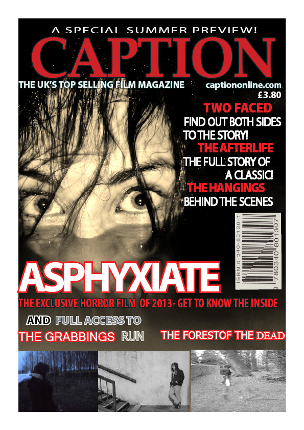
For my poster i have used a close up image of the protagonist making eye contact with the audience to make there attention draw to the magazine. I have used iconography of the reference to the water to relate back to the film and the character rising from the water to also relate back to my film poster 'Karma lies in the depths beneath' which emphasises the fact that the protagonist wants to get revenge on her 'friends' and names
To make my front cover look conventional i have used subsidiary images that relate to the genre of the film magazine and also eye catching titles such as 'full access to' 'the uk's top selling magazine'. I have also used the masthead of my title to relate to film 'Caption' so the audience can relate the meaning of getting images and looking at the footage
I have used red, white and grey as a colour scheme as i believe it works well together and is appealing

No comments:
Post a Comment