Thursday, 26 April 2012

Audience Feedback Questionnaire

1. What genre do you believe the trailer is?

  • Comedy
  • Horror
  • Psychological Thriller
  • Action
  • Sci- Fi


2. Which gender does the trailer target at?

  • Female
  • Male
  • Both


3. What age group do you believe the target audience is for the trailer?

  • 13-19
  • 16-23
  • 15-24
  • 18-53


4. What 3 images stood out the most for you?


5. Can you reveal the basic plot of the story?


6. Who do you believe the protagonist is? (Killer/main character)


7. What are your emotions after watching the trailer?


8. Do you think the trailer reveals too much?


9. Would you go see the film in the cinema?


10. Do you think the soundtrack goes well with the shots in the trailer?

My film magzine front cover

Here is a first draft of my film magazine, i have used other film magazines such as Total Film and Empire to use as guide lines on producing my magazine so it would follow the conventions.


  • For my poster i have used a close up image of the protagonist making eye contact with the audience to make there attention draw to the magazine. I have used iconography of the reference to the water to relate back to the film and the character rising from the water to also relate back to my film poster 'Karma lies in the depths beneath' which emphasises the fact that the protagonist wants to get revenge on her 'friends' and names
  • To make my front cover look conventional i have used subsidiary images  that relate to the genre of the film magazine and also eye catching titles such as 'full access to' 'the uk's top selling magazine'. I have also used the masthead of my title to relate to film 'Caption' so the audience can relate the meaning of getting images and looking at the footage
  • I have used red, white and grey as a colour scheme as i believe it works well together and is appealing


  • For my front cover i have used the same conventions as 'total film' by a close up of the main characters focusing on the eye contact to attract the readers. I have also used banners, titles and a bold masthead.
  • from the total film magazine and my front cover it is evidental that the film the magazine is focusing on is in bold white writing that can stand out the most so the reader can relate to the film the most

My final draft of film poster and explanation


  • My poster focuses on the mise en scene and iconography most i believe this is a key issue to show where the location of the film and also because water is one of the main focus in the trailer
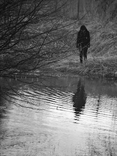
  • I have used the image of a blacked out figure standing by the lake to show hidden identity with a reflection of a shadow which references to a 'ghostly effect' floating on the water rising to the surface, I have also got a ripple effect in the water to suggest movement from below.
  • I have used a bold black and red title which the colours emphasise darkness and death and highlighted the word HATE because it relates to one the trailers themes.
  •  I have used conventions from other film posters such as a tag line, billing block and date. I have put the tag line just above the surface because it relates to the water and can relate to something coming above the surface.
  • I believe that my film poster follows the same conventions as 'friday the 13th' as there is figure of a person over viewing the lake. The mise en scene is roughly the same containing trees, and water.
  • The main images are both long shots with dark lighting to emphasising fear and isolation
  • From looking at 'friday the 13th' poster i have followed the same conventions such as the billing block and website

Monday, 16 April 2012

Image for my film magazine

I decided to use an image of a character for my film magazine because i believe that the readers would want to find out more about the movie than the actor

1st draft of my film poster

I decided to ask the class to look at my poster so i could improve on details that i needed to, to make it more appealing to the audience.

The image i chose for my film poster

I chose the last image because i found the ripples and the reflection in the water really effective  however i decided to edited it to make it more visible and clear by using 'paint shop pro'

ideas of pictures for my film poster

Filming

Our group had a meeting for filming dates. There were a few problems as some of us didn't have the same frees so we had to look at our timetables and agree to certain dates and times, even if certain members of the group were absent we discussed what shots could be filmed with out needing as many people we did this because we needed to take advantage of the cameras use because there are only 2 cameras with 3 groups.

Times that we agreed on:
Wednesday 8th February - Filming in school
Thursday 9th February - Filming in school 
Tuesday 21st February - Filming in school/ filming at a house
Tuesday 28th February - Filming at location of lake
Wednesday 29th February - Filming at location of lake
Thursday  3rd March - Filming at location of lake
Sunday 11th March- Filming at location of a river
Wednesday 14th March- Filming at location of lake- Number of actors needed and props including tent, sign
Monday 19th March- Filming at location of lake


We followed these dates and where we were going to film well, however there were times when we had to cancel filming due to weather and because it was being to dark so we had to re-organsie dates. 

Animatic of film trailer


Group Discussion for film trailer